Design a Social Media Video Ad, the Full Process - Adobe XD, Photoshop & After Effects
Creating a Social Media Ad from Scratch
If there’s one thing I have learned to do from working my whole career in social media advertising, it’s how to spot and appreciating a well-designed ad. For as long as I can remember, every time I see an attention-grabbing ad on Instagram, I save it. This collection has become my go-to bank of inspiration and I would highly encourage any designer, marketer or creative to do the same. Over time, as your collection grows, you’ll start to notice some trends and eventually be able to identify what makes an ad great.
In this video, I’m going to challenge myself to create an engaging social media video ad from scratch and share the full process with you. If you want to download the same images used in this tutorial, you can do so for free via Unsplash here
The Full Process Explained
What software I use
My tools of choice are Adobe XD, Photoshop, After Effects. In the video, I begin by reviewing the hypothetical brief from Magic Mind. As soon as I have a clear understanding of what the objectives are, I will start to do my brand research and begin writing a script. After that, I will begin storyboarding in Adobe XD and use Photoshop for any image retouching that’s needed. Finally, I will export each storyboard into After Effects to bring everything to life with animation.
The Goal of the project
My goal was to make the ad as engaging as possible and the methodology I used was taken from one of the foundational principles of design. Hierarchy is often associated with just the formatting of typography within a design, but there’s so much more going on in the background. When you distil this rule down, hierarchy can be applied to just about anything within digital advertising. For example, in the video I created, my three objectives are as follows:
Hook the user and stop them from scrolling
Intrigue them by giving a reason to keep watching
Deliver the message
The first two steps are the hardest to achieve, but once you have hooked a user and intrigued them, then you can deliver your message.
Storyboarding in Adobe XD
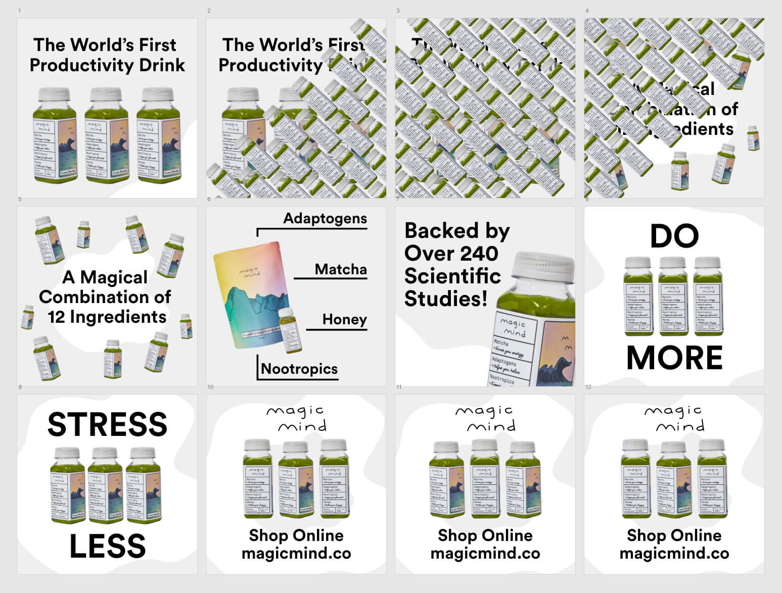
Here’s a final view of the storyboards in XD, ready to be exported into After Effects. This stage of the process is crucial for saving time when it comes to animation. It’s also a good opportunity to show the client how everything looks before you commit to the animation.
Animating a Social Media Video Ad in After Effects
The first part of the animation was designed to grab peoples attention. This was achieved by adding simple quick motion to the bottles and text enter as they both enter the frame. Then the line “the world’s first productivity drink” was strategically placed to add an element of intrigue to keep each user interested.
What you’ll notice is the messaging throughout is clear and concise. This was an intentional decision inspired by a popular UX saying - design with empathy for the user. This is particularly important for the pacing and making sure each message lasts long enough for it to be read, but not too long for a user to lose interest. It’s definitely a balancing act and takes time to get right.
This is what the After Effects project timeline looks like with all the keyframes hidden.
Watch the Finished Ad
Here’s the finished 1:1 ad! Loved working on this project and thank you to Magic Mind for uploading your high-quality images to Unsplash. Let me know in the comments if you have any questions, or what you think?


